O Boticário vs Panvel
My Mission as Head of Art
Two beauty brands, one agency.
We split the teams across two floors.
But how do you split the visual identities in the eyes of the consumer?
For three years, this was one of my main responsibilities at the agency. With both brands having a strong presence on social media—O Boticário alone boasting 11 million Instagram followers—we had to rely heavily on photography style to differentiate them, rather than focusing on typography and other design elements.
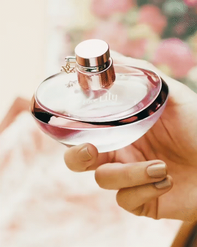
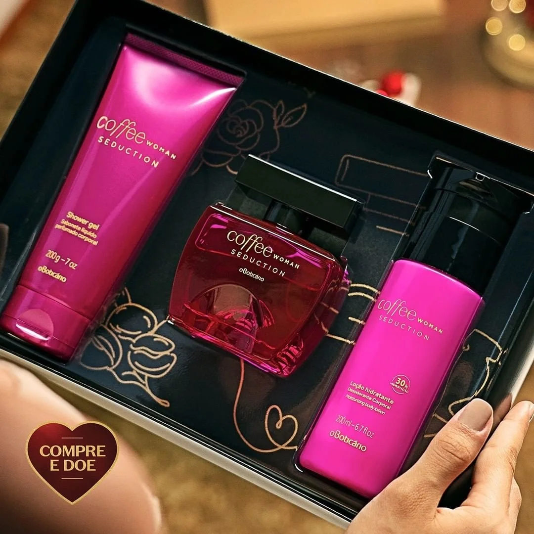
O Boticário
Fashion and pop
O Boticário is a major beauty player in Brazil. We developed a pop, colourful, yet casual photographic style for the brand. The photography captured both products and people in a natural way, embracing the imperfections that make life real. Many shots featured products in hand, just as people naturally use them.


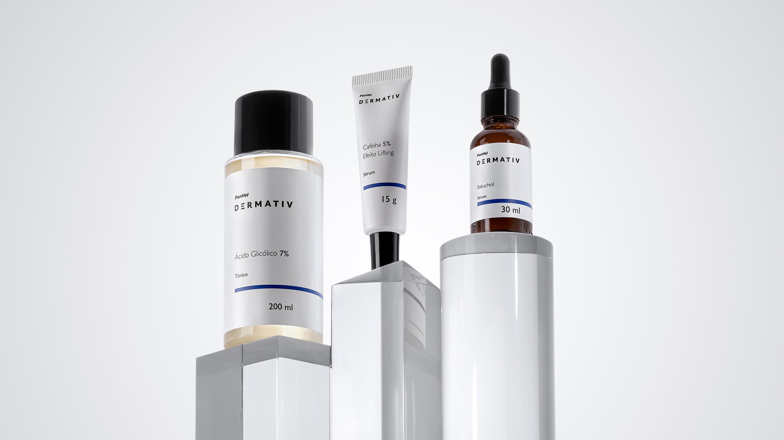
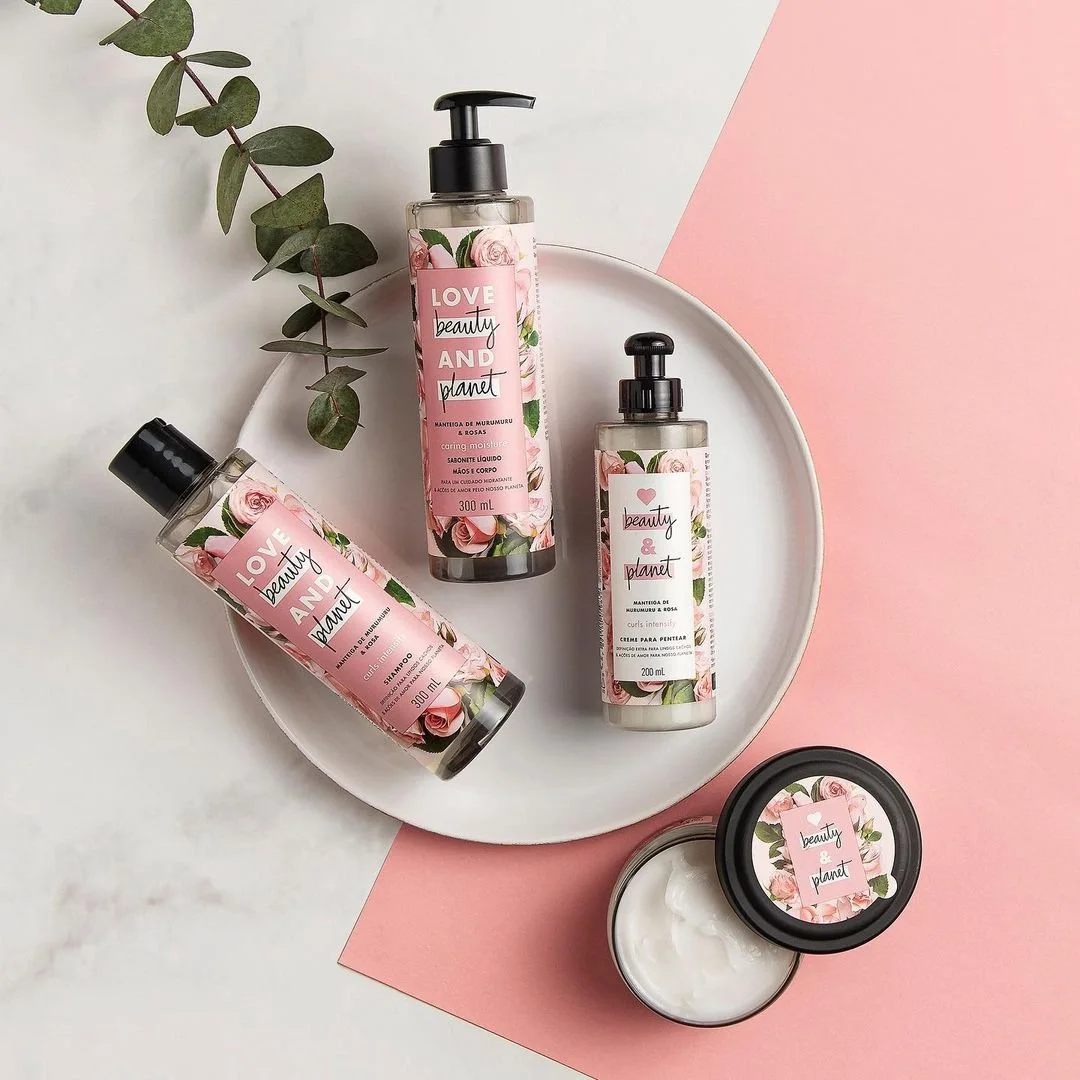
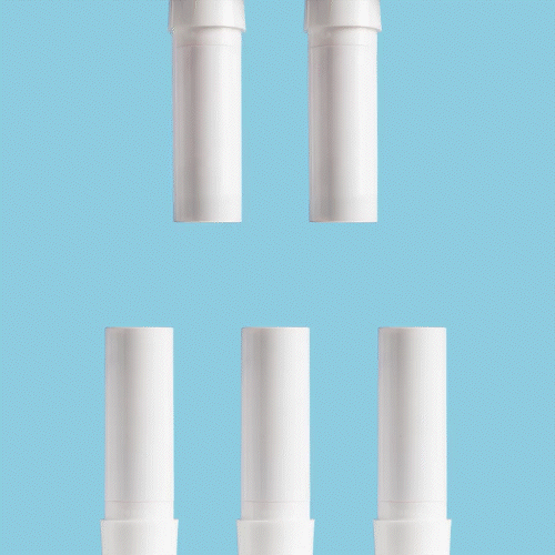
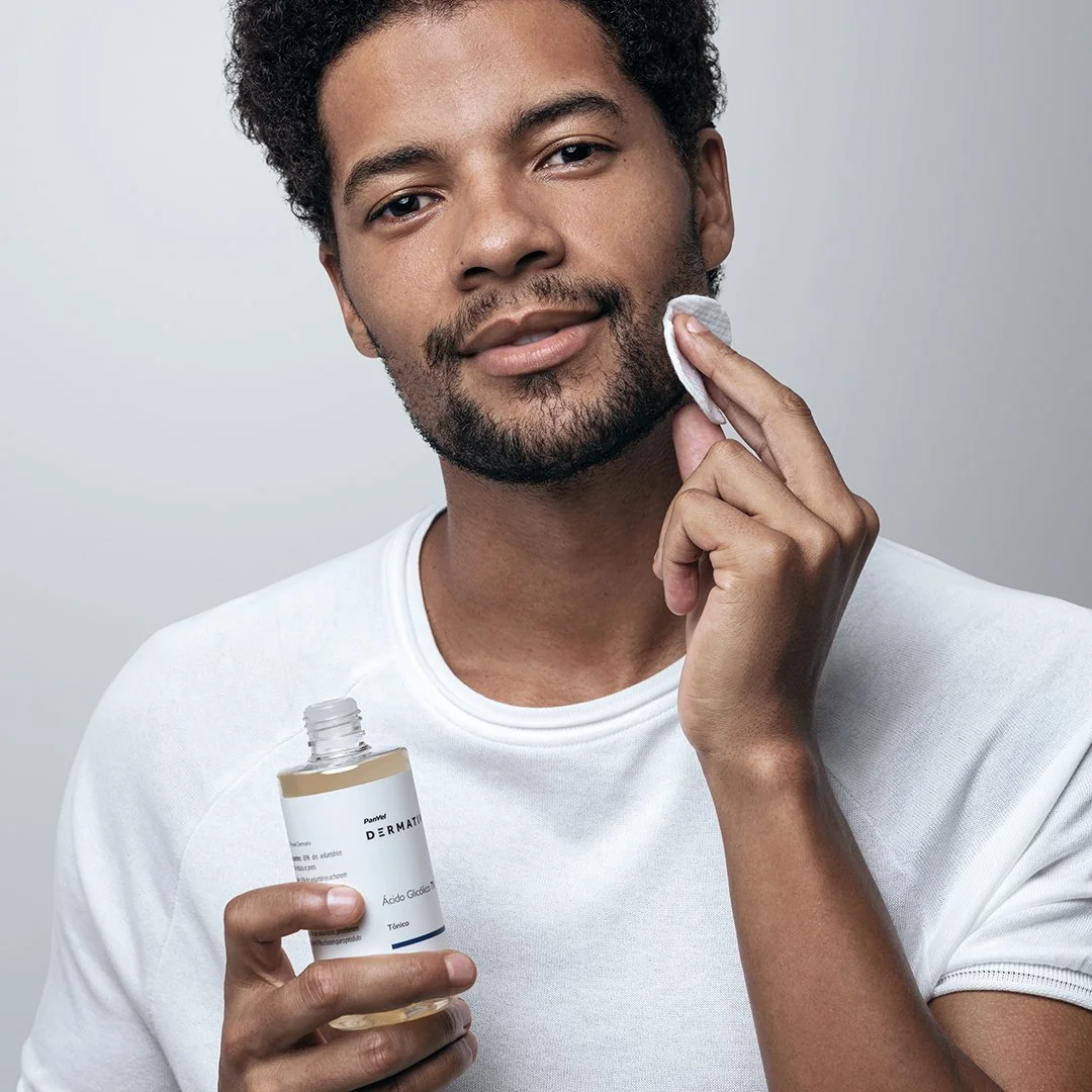
Panvel
Well-being
Panvel is a pharmacy and marketplace with its own beauty brand. Its products are more affordable and could be perceived as lower quality. To address this, we adopted a polished, traditional photographic style to highlight their quality. This was complemented by a clean, pure aesthetic focused on health and well-being.


My Role: Head of Art